.png)
Every summer, a familiar cultural question bubbles up: what is the song of the summer? That one track that defines the season, ubiquitous, catchy, and inescapable. To answer that question, from a data perspective, you might turn to the Billboard Hot 100, a weekly ranking of the top 100 songs and the industry’s go-to chart for measuring popularity.
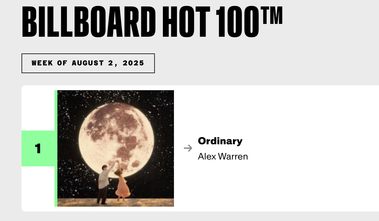
As of Friday, August 1st, “Ordinary” by Alex Warren holds the #1 spot. So… is that it? Have we found the song of the summer?
Maybe…
Whether you are a music exec or just a basic Spotify user, it's intuitive that one week’s ranking doesn’t tell the whole story. What’s more meaningful is the trajectory: How long has the song been on the charts? Has it climbed steadily? Did it just spike this week? Without these answers, your insight into “Ordinary” is, well… quite ordinary. So where Billboard was once simply a ranking, fortunately, today it now includes more metrics, weeks on chart, last week’s position, peak rank—which add valuable context and help us understand momentum, not just position. These take it from ordinary to a little bit extra, although not quite extraordinary yet.
Still, even this distinction—between a static ranking and a few time-aware metrics—is exactly the kind of shift that’s needed in any sort of meaningful analytics, regardless of industry.
Yet, too often, dashboards in the healthcare industry present views like:
- The top 100 most expensive members
- Providers with the highest attributed member counts
- Most frequently billed procedures or utilized services
These rankings are simply distributions of a moment in time. But they are so often visualized, dropped on a dashboard, glossed over with an aesthetically pleasing overlay, and labeled “analytics”. In practice, these views are useful only once—the first time you look at a population, the first time you begin managing a region. Without time context, they become trivia, not insight. And because in healthcare, changes tend to be minute signals, not seismic shifts (unless we’re talking about COVID), these distribution views often look the same week to week, month to month, even year to year.
If so, then why are static rankings so common? Partly because modern BI tools make it easy to generate them–you can visualize a frequency distribution in Power BI or Tableau just about as fast as ChatGPT. And partly because traditional analytics education focuses on snapshot analysis–students are handed datasets and asked to analyze it once and move onto the next project. But analytics in the real world needs more. A seasoned business owner and operator intuitively understands the importance of knowing: What’s changing? Where is something trending up, or down? What do I need to act on? And if you want to make it even more meaningful: What have I acted on, how has it impacted outcomes, and what can be improved?
At Innovaccer, we’re continually rethinking and reshaping our analytics to support this paradigm. Our goal is to give operators what they crave, to not just show who’s #1, but how they got there—and whether they’re staying there. That’s what decision-makers actually need: not just the hit of the week, but the insight to anticipate the next one.
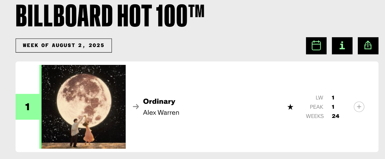
Circling back to our summer song example, “Ordinary” has been on the charts for 24 weeks and was also #1 last week. And this is where these metrics, while more insightful than just the ranking, fall short.

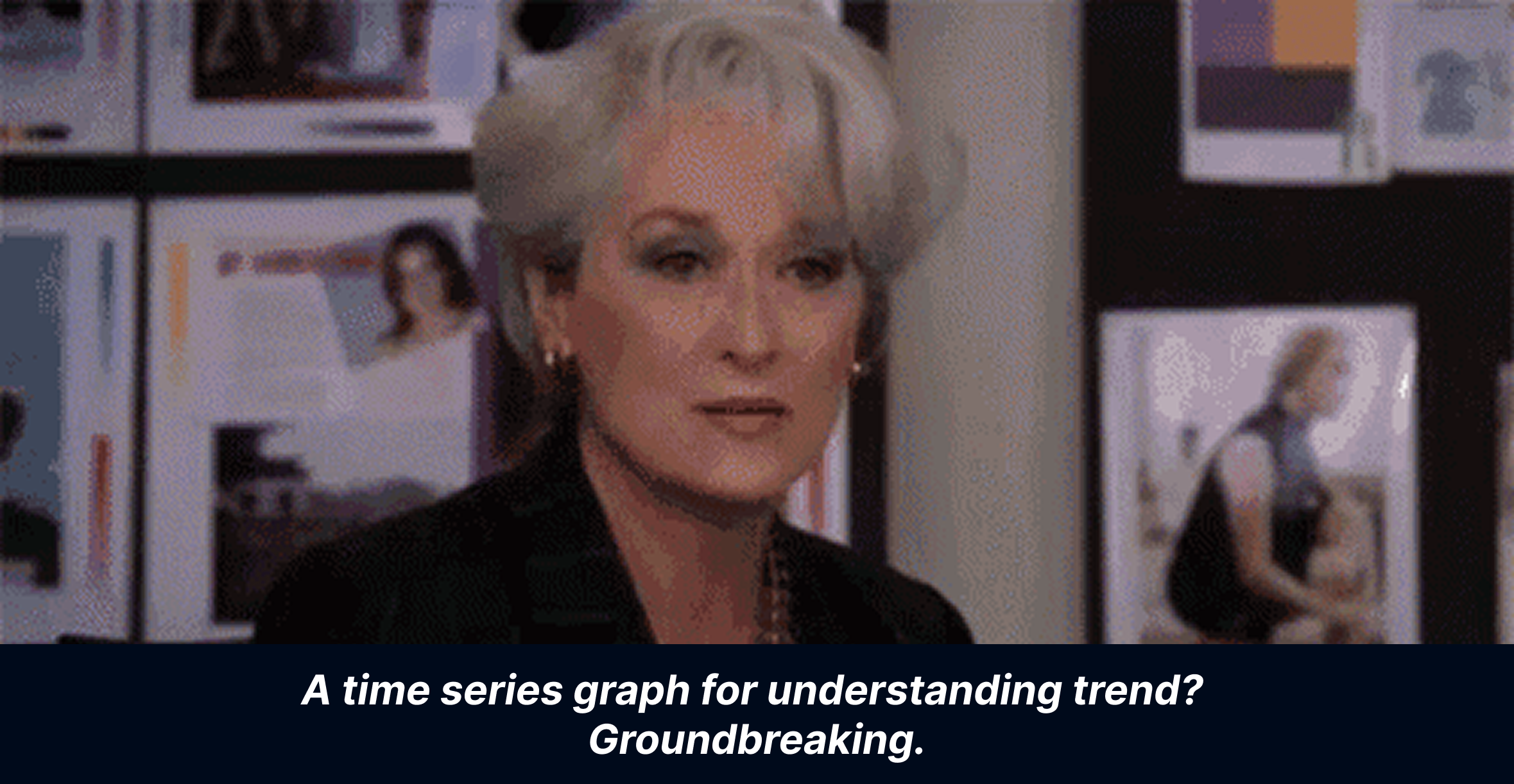
Any discussion on time and analytics naturally invites us to visualize and graph against time. And when we do, it becomes immediately clear: “Ordinary” rose steadily as summer began and has held its position ever since. The pattern is unmistakable. It might just be the song of the summer.

Data: [https://musicchartsarchive.com/singles/alex-warren/ordinary]
Now, I know what you might think: this kind of time-based insight feels obvious.
And indeed, it is… in the context of a single song. But in healthcare—where we’re tracking thousands of providers, hundreds of thousands of patients, and a complex web of codes and procedures—it’s much harder to separate the signals from the noise. And that’s exactly the challenge we’re tackling. Stay tuned as we share more strategies we’re using to help healthcare leaders move beyond static dashboards and uncover the dynamics that truly matter.